Why onboarding screens are a must for every app?
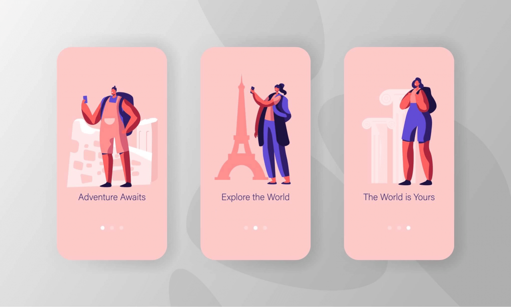
Let’s face it, we’ve all been interviewed at some point or the other in our lives. And while we are giving an interview, our endeavours are to make an everlasting impression during our first 10 seconds with the interviewers. Similar is the case with the apps. The app when greets a new user is being interviewed by them. And the fast paced world of today has made app users impatient, fickle and hard to please than ever. They expect their first contact with an app should leave unceasing positive effect on them. How can we achieve this? This brings us to our topic of “why onboarding screens are a must for every mobile app?”.
The What’s & Why’s of An App onboarding
Onboarding is nothing but a science behind how users react to the app upon their first time use. Apparently, for the new users it is difficult to navigate an app especially when the user interface is uncommonly than they are accustomed to. Shouldn’t there be a set of screens that brief or progressively assist users in navigating an app? Surely an impeccable onboarding would count for the best user experience and ensure a long term ongoing engagement with the app.
Growth guru Andrew Chen stated that about 79% of the users abandon the app within five to seven days of using it. Hence, it becomes pivotal to impress the first time app users in a very small window that lasts not more than 20 seconds. We at Yati Labs do dry run sessions thats lasts less than 20 seconds and if the app fails to impress, it’s time to look into the causes.
“Onboarding at its core is a learning process, so use education techniques to teach users and build their confidence”
The important thing to note is that you have managed to get your app downloaded by the users. Now it is time to live up to their expectations and fulfil the purpose you wanted users to use the app for. Lets talk about variety of approaches that you could implement on the basis of your business case.
Types of Onboarding
Depending on your business, there are different types of onboarding one could implement. There are namely 5 types of app onboarding process and we cite the examples to support you in decision making and to get your users snapped to the app.
Progressive Approach
Progressive approach is used when you want to show new information to the users as they navigate within the app. This process comes in handy,
- If your app uses a fresh user interface and user experiences that you think users aren’t accustomed to.
- If you are entering a market with a niche idea and you want to guide users at every step until user journey within the app is finished
Action-Oriented Approach
This approach calls for some users actions before the app generates information to them. It is particularly used by the apps that rely on user generated content. For example,
- Users are needed to complete certain steps in order for the app to feed them with useful information. For instance, categories selection in Flipboard app.
- Quora, the famous Q&A site, onboards its users by prompting them to follow the topics and finding their friends in order to generate the curated content on their feed.
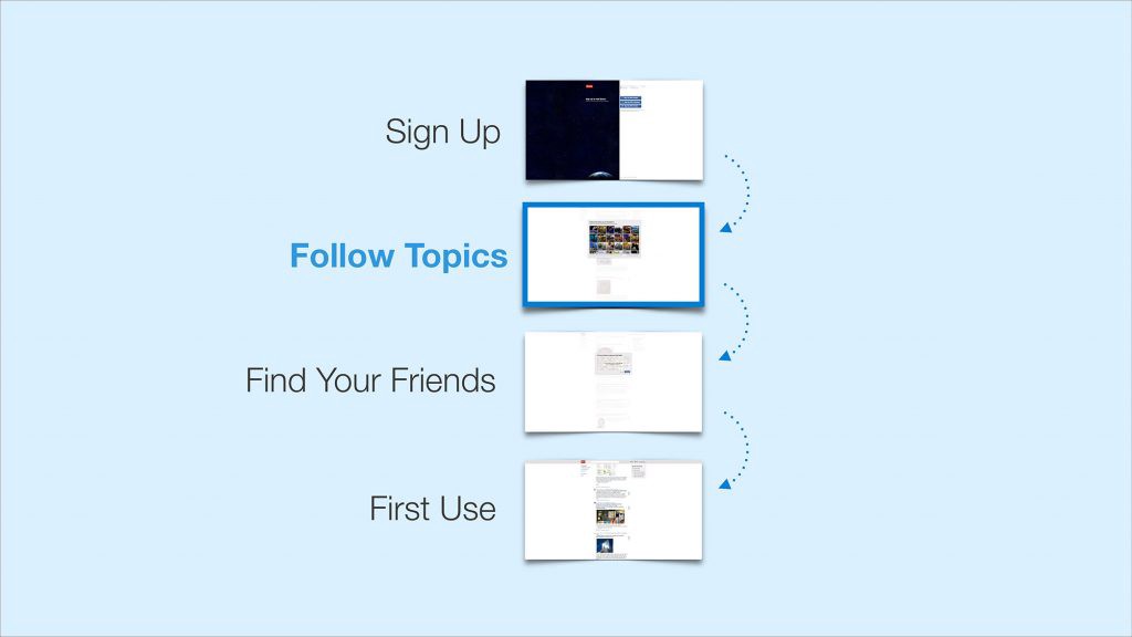
- World famous music app Spotify asks users for the artists/genres/categories in order to curate content on their home feed for them.
Advantage-Oriented Approach
This approach weighs benefits more than the features during the initial contact of users with the app. You should use this kind of onboarding process when you want your users to know how this app can impart values into your life and how they could benefit from the same. For example,
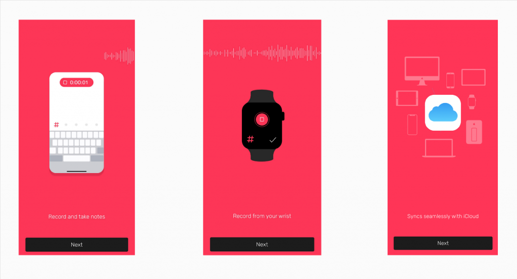
- Noted app, the tasks taking app in its onboarding process illustrates how users could get their stuff done with ease by simply speaking into their smartphone app or smartwatch app. And all the recordings are saved with timestamps and shared seamlessly across all devices.
- Google Docs app also uses advantage-oriented approach to onboard its app users. The core benefits outlined by google via their onboarding are real-time collaboration, syncing and editing with peers.
Features List Approach
As the name suggests, this approach enlists the features i.e what the app does over instead how to use the app in its onboarding screens. This method is advocated for the app owners that want their users to understand how the app functions which is done by designing related visuals and text in the app onboarding screens. For instance,
- Nike Run Club app shows how users could benefit from its coaching, workout, challenge and tracking features.
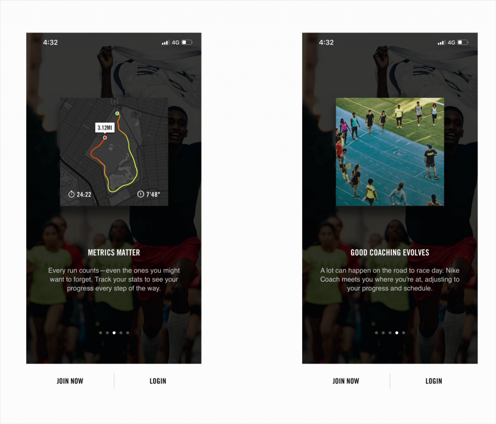
- If your app involves some complex functionality it is important that you use the features list approach for onboarding.
Hybrid Approach
The hybrid approach comprises the combination of both progressive and features to convey the users during the app onboarding. The way you could harness the power of this technique is before the signup process or actual usage of the app, communicate with users about the features that progress them with the features as they navigate within the app.
- Grammarly utilizes a hybrid approach during its app onboarding process.
Another way of potentially using the hybrid approach is by communicating both the benefits and features during the onboarding process. For example,
- If your app provides value and also pertains to some complicated functionality, you could adopt a hybrid process of onboarding.
Positive Onboarding Experience Adds Great Value To Your App
An effective and smooth onboarding experience boils down to your ability to connect the initial steps you’re asking users with the value your product brings at the end of the day. The quicker you guide your users to the app or communicate the value of your app using time-tested education techniques and modern tools like Product Tours, the more likely your new users will turn into long-lasting customers.
Looking get Onboarding screens designed for smooth and seamless UX? Contact us
